Loading...
Panell Collection: 7 Families, 28 Weights, 56 Styles
Brutalist, uneven panels

Variable Font: 3 Axes

Weight
400
Slant
-14
Width
78
Loading...

Families

Panell Compressed, 8 Styles
Loading...
Loading...
Loading...
Loading...
Loading...
Bold
Panell Condensed, 8 Styles
Loading...
Loading...
Loading...
Loading...
Loading...
Bold
Panell Narrow, Features: ss01
Loading...
Loading...
Loading...
Loading...
Loading...
Bold
Panell Standard, 8 Styles
Loading...
Loading...
Loading...
Loading...
Loading...
Bold
Panell Wide, 8 Styles
Loading...
Loading...
Loading...
Loading...
Loading...
Bold
Panell Extended, 8 Styles
Loading...
Loading...
Loading...
Loading...
Loading...
Bold
Panell Expanded, 8 Styles
Loading...
Loading...
Loading...
Loading...
Loading...
Bold

Styles

Panell Collection: 7 Families

Loading...
Loading...

Loading...
Loading...

Loading...
Loading...

Loading...
Loading...

Showcase

Features

Total: 14 Stylistic Sets, 10 Figure Sets, 4 Others

Note: Create your own version of our retail typefaces using available alternates and other OpenType features via our Editor.

Glyphs

Detail

Shown: 0 of 0 glyphs

Support

Languages

Afrikaans, Albanian, Bosnian, Bulgarian, Catalan, Croatian, Czech, Danish, Dutch, English, Esperanto, Estonian, Filipino, Finnish, French, German, Greek, Hungarian, Icelandic, Indonesian, Irish, Italian, Latvian, Lithuanian, Luxembourgish, Macedonian, Polish, Portuguese, Romanian, Russian, Scottish Gaelic, Serbian, Slovak, Slovenian, Spanish, Swedish, Swiss German, Turkish, Ukrainian, Welsh 

opentype features
calt
Contextual Alternates
case
Case-Sensitive Forms
ccmp
Glyph Composition
dnom
Denominators
frac
Fractions
locl
Localized Forms
Character sets
  • MS Windows 1026 Latin-2 Central European
  • MS Windows 1140 Latin-3 South European
  • MS Windows 1250 Central European Latin
  • MS Windows 1251 Cyrillic
  • MS Windows 1252 Western (Standard Latin)
  • MS Windows 1254 Turkish Latin

Documentation

1/0

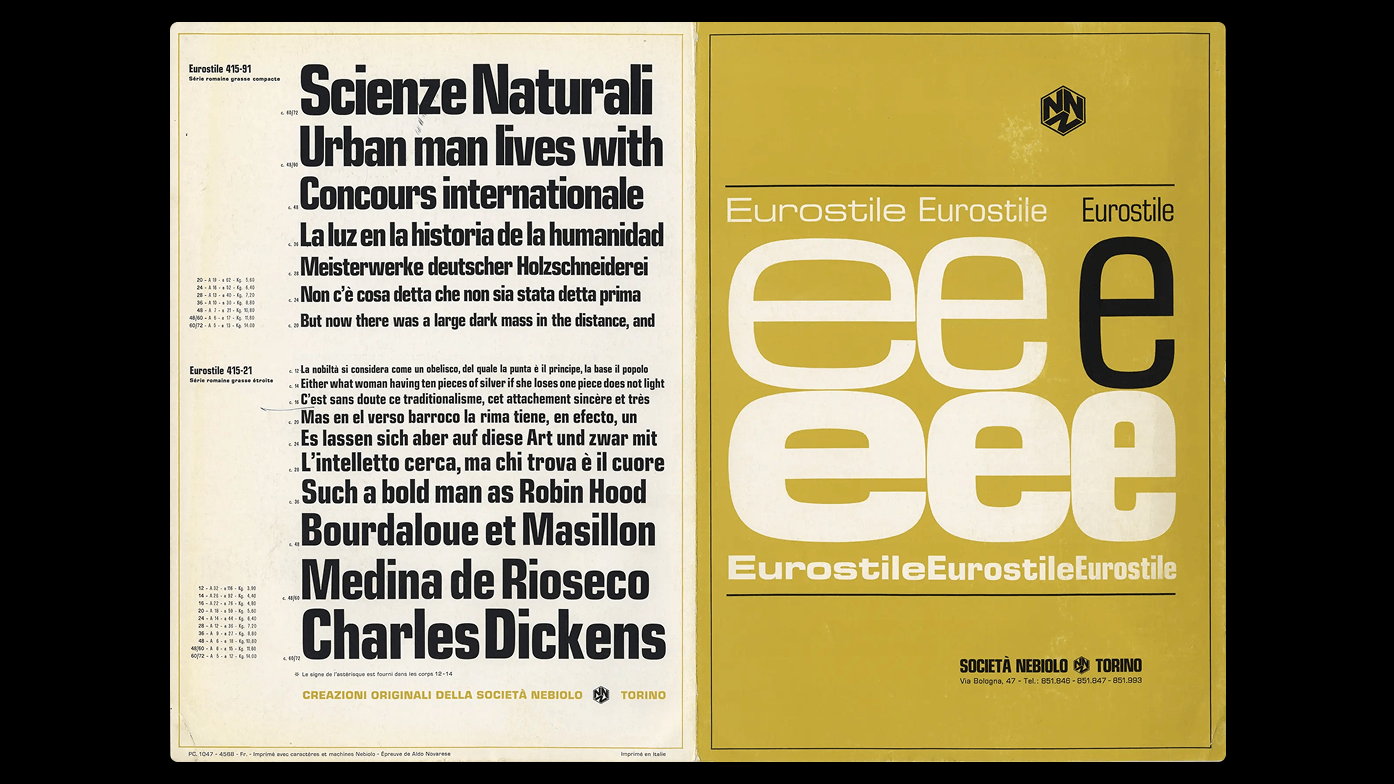
The type specimen catalog for Eurostile font, designed by Aldo Novarese for Societa Nebiolo Torino. Printed in Italy for Amsterdam Continental Types and Graphic Equipment, New York 1965.  Size: folded: 18 x 25 cm; open: 34 x 75 cm / 2 color tri-fold pamphlet. Source

“The horse is better than most 1970 cars” Renault ad. A lesser known member of the Eurostile series, in use for a 1970 ad by Renault. Issued by Nebiolo as Eurostile stretto nero, it was named Bold Condensed for international markets. Source

The construction of the letters. A humanistic approach inspired by old-style Roman serif typefaces is integrated into Panell’s construction through a diagonal contrast axis. This contrast is applied within its brutalist geometric shapes, where the main character of the typeface becomes especially visible.

The letter “O” in Panell Narrow Bold. Standout detail is the uneven construction of the letters, where one diagonal has sharper rounding, and the opposite diagonal uses a different radius.

The letter “O” tension. Inner corners reminds very well known construction of such gigant like Eurostile but the tension comes from solution of outter curve.

Stylistic Set 01 (alternate version for letters: “a, b, d, g, m, p, q). Selected inktraps are intentionally fullfiled to bring into this set another aesthetic dimension.

The typeface was presented at the “Alterace” exhibition, where projects were selected through a curatorial process prioritizing sustainability and both human and non human needs.

The first version of the typeface was created for the “Alterace” conference, which focused on sustainability and interdisciplinary collaboration.

Dolomiti is a typeface from the Italian wood and plastic type foundry Xilografia Adige, located in Verona. The name xilografia refers to woodcut printing, reflecting the workshop’s focus on producing large display types for letterpress printing.

Info

description

Panell is a punchy take on a familiar answer, just viewed from a different angle. This boxy typeface collection, with its irregular rounded corners, draws from a kind of new brutalism, inspired by concrete housing blocks, balances between a humanized and technical aesthetic. Styles range across four weights, from Regular to Bold, and seven widths, from Compressed to Expanded. The idea of stretching proportions is supported by its variable font format.

Sure, the typeface might remind some of the iconic Eurostile (Microgramma), or perhaps Compacta or Earth, but Panell confidently breaks away. It has a futuristic, technical vibe: a geometric sans–serif with its own strong attitude. One standout detail is the uneven construction of the letter “o”, where one diagonal has sharper rounding, and the opposite diagonal uses a different radius. This subtle tension propels the rhythm forward and gives the typeface its original momentum.

There are playful touches too, like the shortened bottom arms of “f”, “t” and “y,” which get space to shine, and these are hidden within stylistic sets. Another important source of tension comes from moments where opposites meet rounded corners appear only in specific places. Numerous OpenType features provide portfolio of multiple options for any hungry designers. The last but not least are sporty, forward–leaning italics add the burst of energy you need for bold, dynamic designs.

credits
DesignIlya Bazhanov
Spacing & KerningIgino Marini
Details
Range28 Weights, 56 Styles
3 VF Axes: Weight, Width, Slant
First SketchOct 2021
ReleasedMar 2026
UpdateMar 2026
Version1.000