Loading...
Reckless Collection: 9 Families, 72 Weights, 144 Styles
3 Width Families: Condensed, Standard, Wide each has 3 Contrast Sub-Families: S, M, XL

Variable Font: 3 Axes

Weight
400
Contrast
50
Width
100
Loading...

Families

Reckless Condensed S, 16 Styles
Loading...
Loading...
Loading...
Loading...
Loading...
Loading...
Loading...
Loading...
Loading...
Thin
Reckless Standard S, 16 Styles
Loading...
Loading...
Loading...
Loading...
Loading...
Loading...
Loading...
Loading...
Loading...
Light
Reckless Wide S, 16 Styles
Loading...
Loading...
Loading...
Loading...
Loading...
Loading...
Loading...
Loading...
Loading...
Book
Reckless Condensed M, 16 Styles
Loading...
Loading...
Loading...
Loading...
Loading...
Loading...
Loading...
Loading...
Loading...
Regular
Reckless Standard M, 16 Styles
Loading...
Loading...
Loading...
Loading...
Loading...
Loading...
Loading...
Loading...
Loading...
Medium
Reckless Wide M, 16 Styles
Loading...
Loading...
Loading...
Loading...
Loading...
Loading...
Loading...
Loading...
Loading...
SemiBold
Reckless Condensed XL, 16 Styles
Loading...
Loading...
Loading...
Loading...
Loading...
Loading...
Loading...
Loading...
Loading...
Bold
Reckless Standard XL, 16 Styles
Loading...
Loading...
Loading...
Loading...
Loading...
Loading...
Loading...
Loading...
Loading...
Heavy
Reckless Wide XL, 16 Styles
Loading...
Loading...
Loading...
Loading...
Loading...
Loading...
Loading...
Loading...
Loading...
Book

Styles

Reckless Collection: 9 Families

Loading...
Loading...

Loading...
Loading...

Loading...
Loading...

Loading...
Loading...

Loading...
Loading...

Loading...
Loading...

Loading...
Loading...

Loading...
Loading...

Showcase

Features

Total: 12 Stylistic Sets, 9 Figure Sets, 6 Others

Note: Create your own version of our retail typefaces using available alternates and other OpenType features via our Editor.

Glyphs

Detail

Shown: 0 of 0 glyphs

Support

Languages

Afrikaans, Albanian, Bosnian, Bulgarian, Catalan, Croatian, Czech, Danish, Dutch, English, Esperanto, Estonian, Filipino, Finnish, French, German, Greek, Hungarian, Icelandic, Indonesian, Irish, Italian, Latvian, Lithuanian, Luxembourgish, Macedonian, Polish, Portuguese, Romanian, Russian, Scottish Gaelic, Serbian, Slovak, Slovenian, Spanish, Swedish, Swiss German, Turkish, Ukrainian, Vietnamese, Welsh 

opentype features
calt
Contextual Alternates
case
Case-Sensitive Forms
ccmp
Glyph Composition
dlig
Discretional Ligatures
dnom
Denominators
frac
Fractions
Character sets
  • MS Windows 1026 Latin-2 Central European
  • MS Windows 1140 Latin-3 South European
  • MS Windows 1250 Central European Latin
  • MS Windows 1251 Cyrillic
  • MS Windows 1252 Western (Standard Latin)
  • MS Windows 1254 Turkish Latin

Documentation

1/0

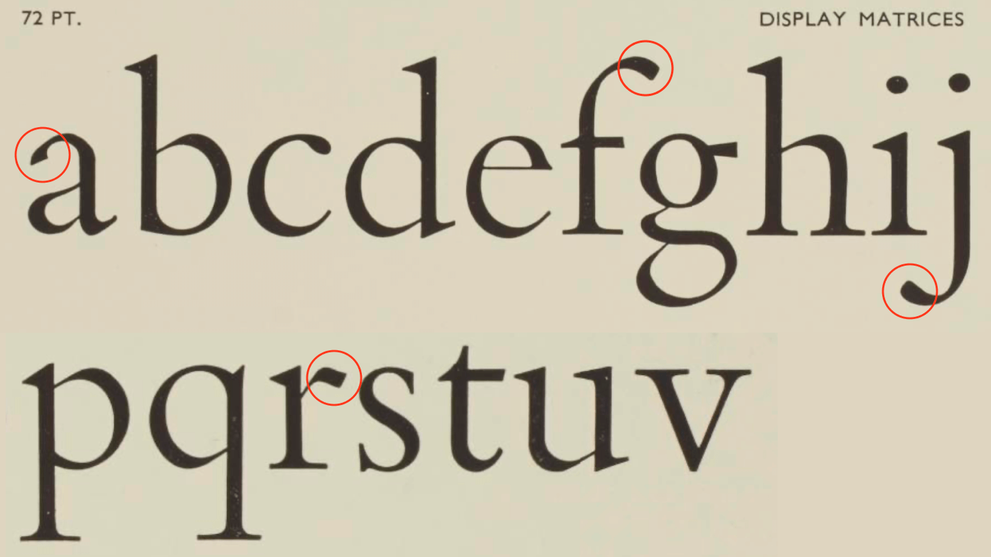
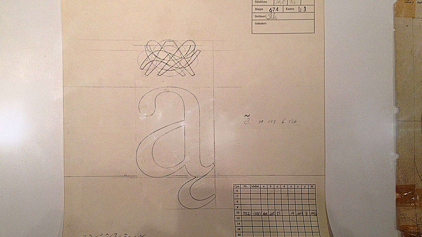
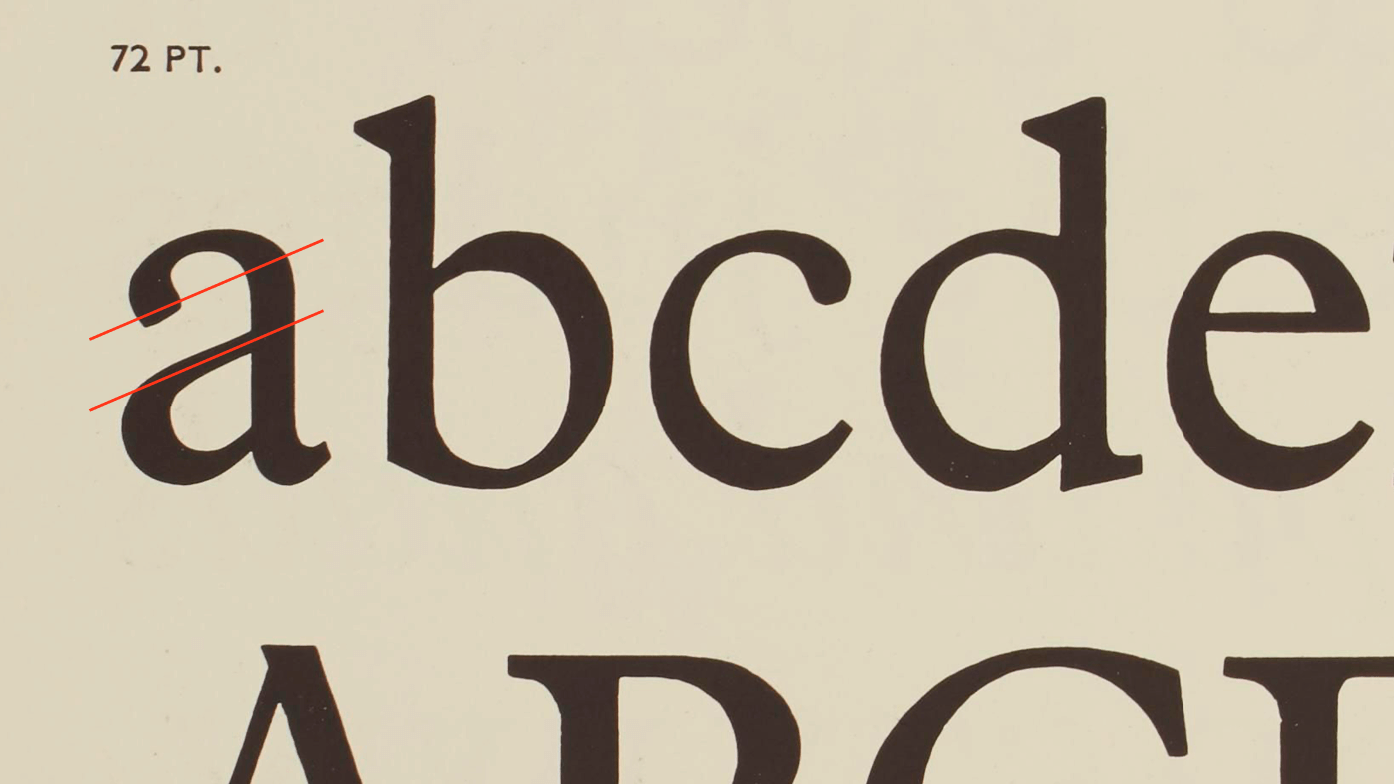
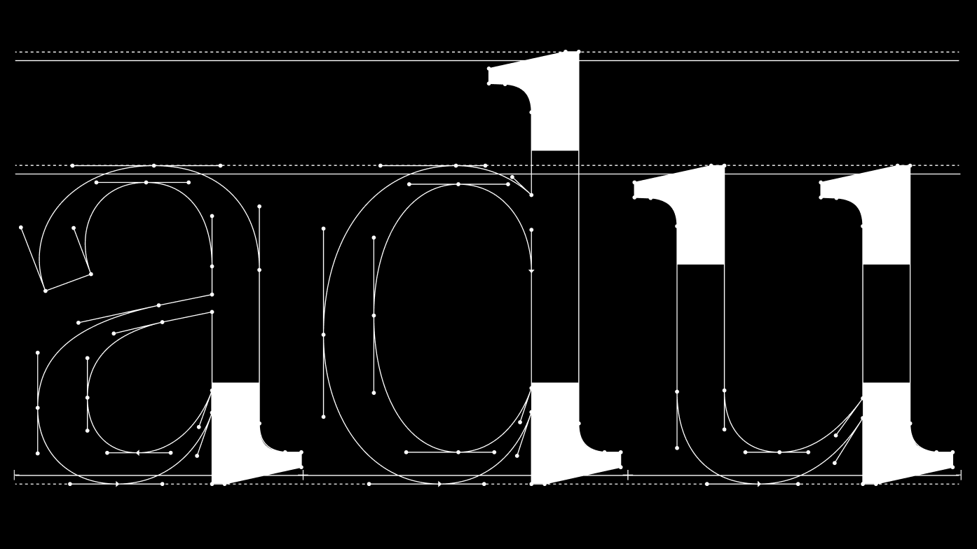
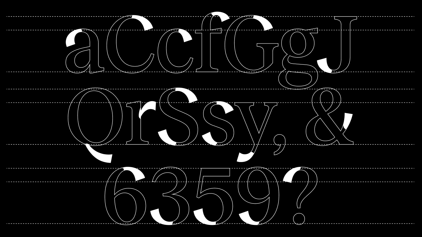
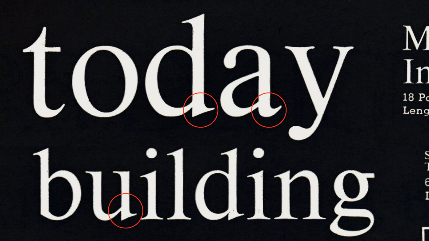
The letter inconsistencies in Times and other traditional serif typefaces served as the starting point. In particular, the different shapes of the bottom parts in the letters “a, d, u” made me rethink why they are designed differently — and why not give them a consistent form. Source

Bembo typeface, calligraphy terminals. The letters “a, f, j, r,” where the terminals follow a calligraphic approach, caught my eye and sparked the idea for Reckless. It made me wonder where else such terminals could be used. Source

Research & studies during UAL London internship. In September 2012, in London, Martin Vácha researched serif typefaces in the Monotype archives during a major exhibition. The result was the first draft of Reckless.

Plantin typeface, the “a” detail. The detail in the letter “a,” where the calligraphic terminal of the top part ends in the same direction as the bowl of the upper part, is particularly elegant. Source

Reckless Medium, consistency: Finally, in September 2012, the first version of Reckless was drawn, where the bottom parts of the letters “a, d, u” share a consistent solution.

Reckless Medium, calligraphy terminals: A list of basic characters where the calligraphic terminals are applied.

De Vinne Series, specimen book from Barnhart Brothers & Spindler, 1907. The final piece of the puzzle comes from the terminal treatment of the letters “C, c, G, S, s”. Source

Gerrit Dou: Scholar Sharpening His Quill, 1635. The master himself prepares his tool for the renaissance of calligraphy. I put everything I liked into the mixer, and Reckless is the final cocktail. That’s the reason for the name, by the way. Source

Info

description

Reckless is a serif typeface with a renaissance (old-style) character and a notably raised x-height. It was designed through an in-depth study of the historical development and origins of serif typefaces in various libraries. The central concept draws from the calligraphic influences of early serif designs, blending these traditional elements with a contemporary aesthetic.

Beyond its aesthetic appeal, Reckless is highly versatile in terms of language support. In addition to Latin and Central European languages, it now includes Vietnamese, Greek, and Cyrillic scripts. The collection has recently expanded with three width families: Condensed, Standard, and Wide. Each width is available in three contrast levels: S for smaller text with thick serifs and lower contrast, M for medium sizes, and XL with higher contrast, ideal for large-scale applications.

credits
DesignMartin Vácha
AssistanceDaniel Quisek, Marek Čuban
Spacing & KerningIgino Marini
Language ExpansionIlja Bazhanov, Irene Vlachou, Tuan Vuong
Details
Range72 Weights, 144 Styles
3 VF Axes: Weight, Contrast, Width
First SketchSep 2012
ReleasedJun 2014
UpdateFeb 2026
Version3.002

The legacy versions of Reckless and Reckless Neue have now been replaced with the new Reckless Collection. Please note that we are unable to provide the legacy versions anymore!

You can find below all versions and test them to find the closest match. Unfortunatelly you can not reach identical solutions!