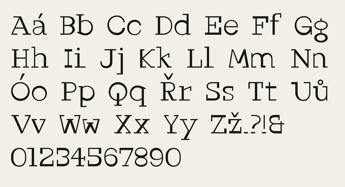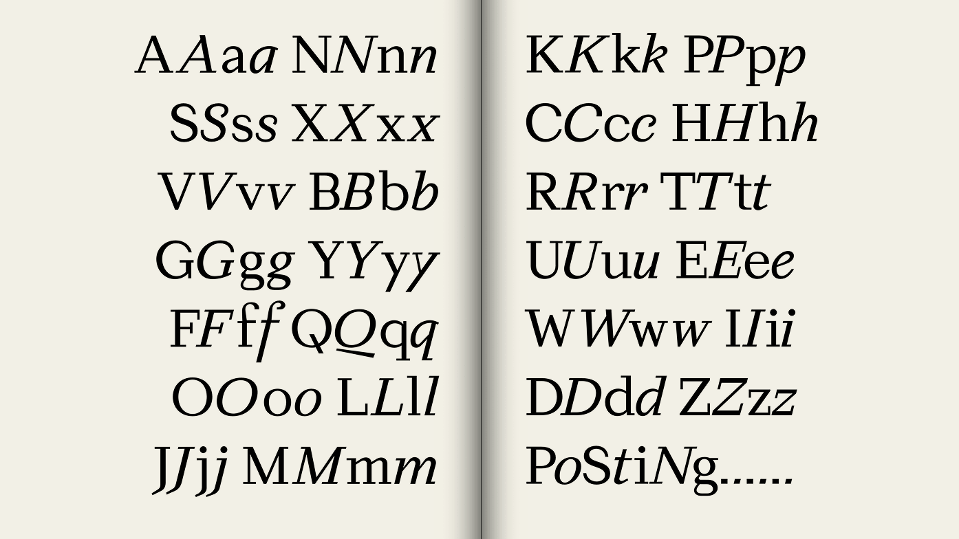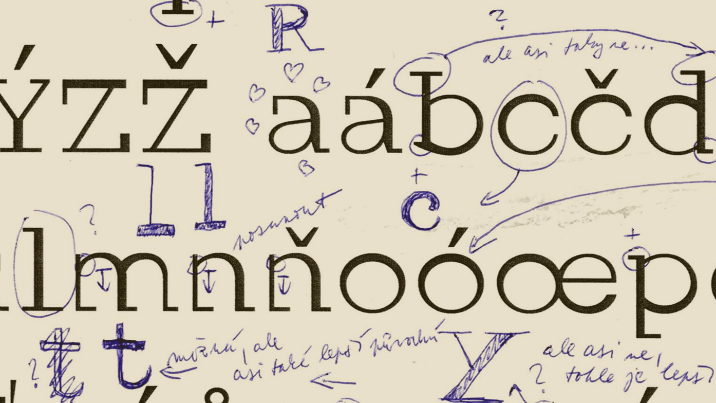
First sketches of Post (2022)
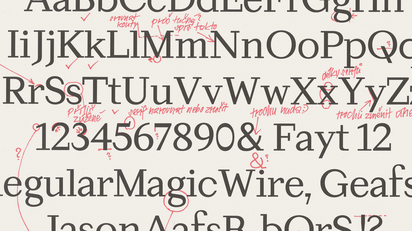
Long before Post, there was a typeface: a strangely authentic interpretation of a glitched-out Courier. It’s stroke variation was based solely on poorly placed pixels. Even so, the typeface remained fully readable at smaller sizes, which led Viktor to conduct separate research into readability.