Loading...
Cassette Collection: 3 Families, 21 Weights, 42 Styles
Another sans-serif you didn’t know you needed

Variable Font: 3 Axes

Weight
400
Slant
0
Mono
60
Loading...

Families

Cassette, 14 Styles
Loading...
Loading...
Loading...
Loading...
Loading...
Loading...
Loading...
Loading...
Thin
Cassette SemiMono, Features: ss12, ss14
Loading...
Loading...
Loading...
Loading...
Loading...
Loading...
Loading...
Loading...
Bold
Cassette Mono, 14 Styles
Loading...
Loading...
Loading...
Loading...
Loading...
Loading...
Loading...
Loading...
Heavy

Styles

Cassette Collection: 3 Families

Loading...
Loading...

Loading...
Loading...

Loading...
Loading...

Loading...
Loading...

Loading...
Loading...

Loading...
Loading...

Loading...
Loading...

Showcase

Features

Total: 14 Stylistic Sets, 10 Figure Sets, 5 Others

Note: Create your own version of our retail typefaces using available alternates and other OpenType features via our Editor.

Glyphs

Detail

Shown: 0 of 0 glyphs

Support

Languages

Afrikaans, Albanian, Bosnian, Catalan, Croatian, Czech, Danish, Dutch, English, Esperanto, Estonian, Filipino, Finnish, French, German, Hungarian, Icelandic, Indonesian, Irish, Italian, Latvian, Lithuanian, Luxembourgish, Polish, Portuguese, Romanian, Scottish Gaelic, Slovak, Slovenian, Spanish, Swedish, Swiss German, Turkish, Welsh 

opentype features
calt
Contextual Alternates
case
Case-Sensitive Forms
ccmp
Glyph Composition
dnom
Denominators
frac
Fractions
liga
Standard Ligatures
Character sets
  • Adobe Latin-1
  • MS Windows 1026 Latin-2 Central European
  • MS Windows 1140 Latin-3 South European
  • MS Windows 1250 Central European Latin
  • MS Windows 1252 Western (Standard Latin)
  • MS Windows 1254 Turkish Latin

Documentation

1/0
Cassette is a compilation of unused principles.

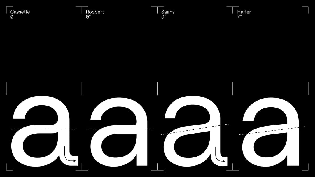
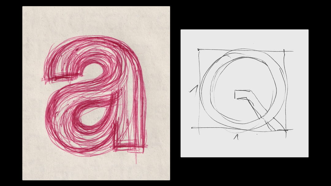
Whenever a design idea didn’t find its place in projects like Saans, Roobert, or Haffer, it was put in a drawer for a while and later found a new life in Cassette. If you’re wondering where the differences are, you can explore them now. (Sketch of the letter “a, Q” for Roobert, September 2016.)
Strict and cold, without compromises, but still accessible

The design is one of our least human sans-serifs, with a strong technical vibe and cold, no contrast, no angles in ink–trap parts, constructed forms typical of a grotesk typeface.

Overal differences.

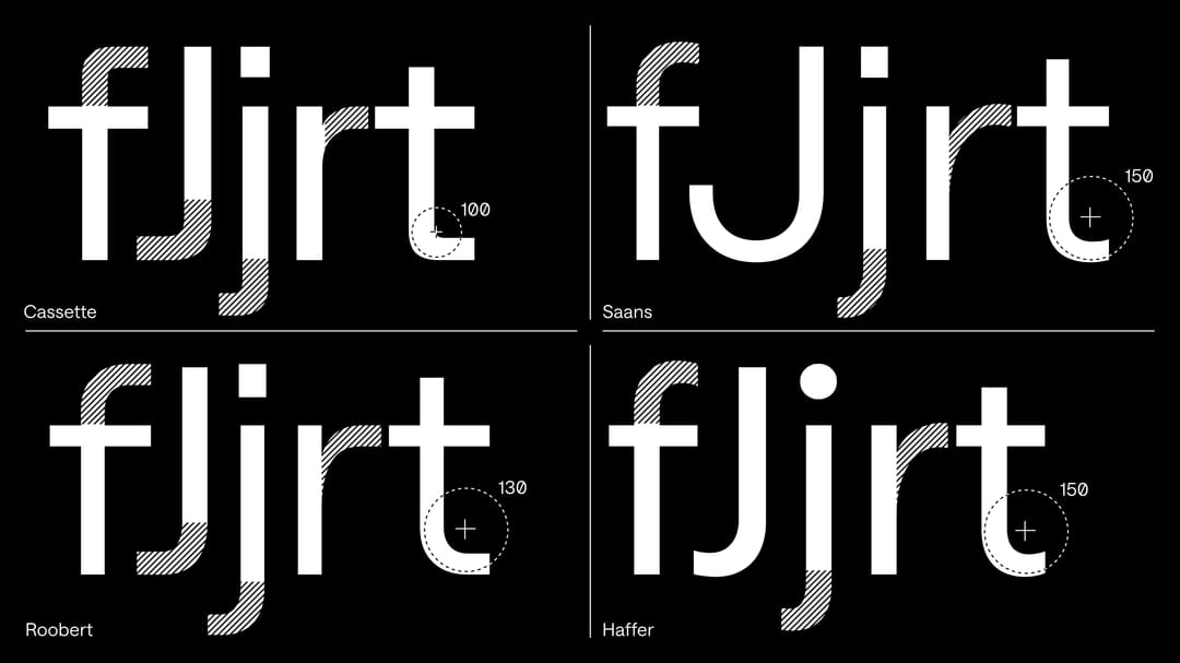
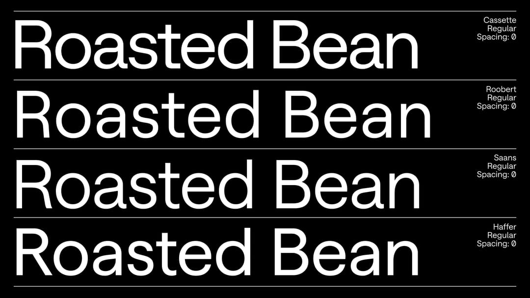
Cassette uses tighter spacing and wider proportions compared to the other projects. Saans and Haffer also follow a more lively terminal concept, while Roobert and Cassette have a more technical approach.

Always the same, but still different.


Cassette “a” was one of unused version for Roobert and Saans. So here the last piece of puzzle ended. Finally this design of “a” found his place.

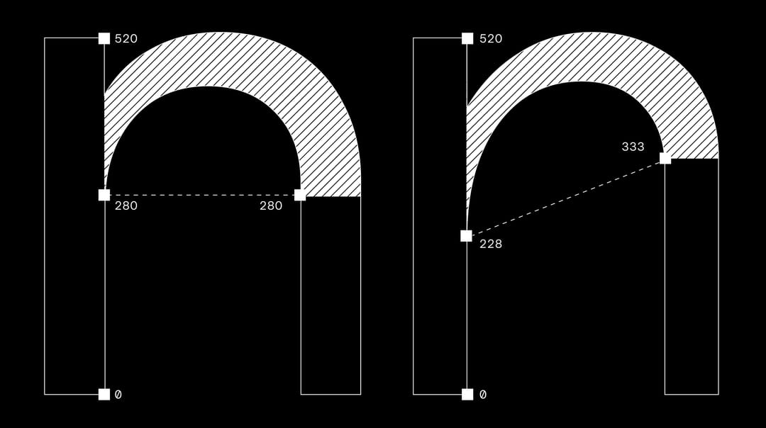
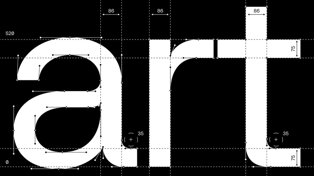
Arch shaping follows a technical, cold vibe.

The connections to the stems are highly constructed, with only slight tapering. This keeps the design clear and legible at smaller sizes, even in bolder styles.

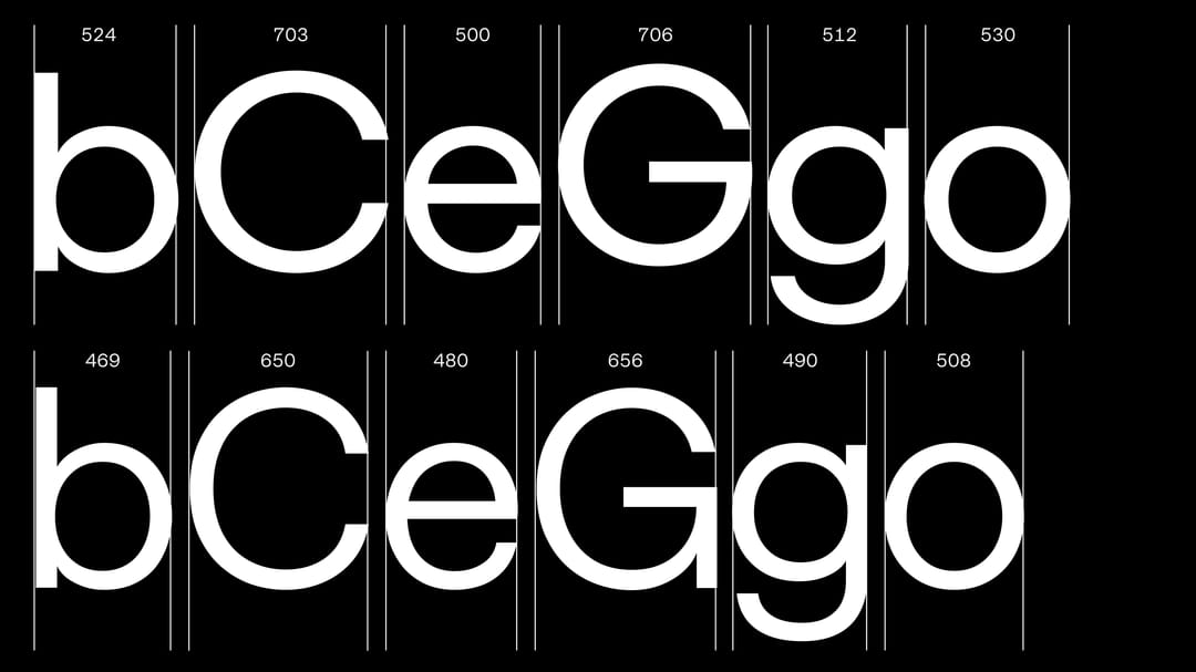
Wider proportions for circular letters.


Compared to the other projects, Cassette uses wider proportions for its circular letters.

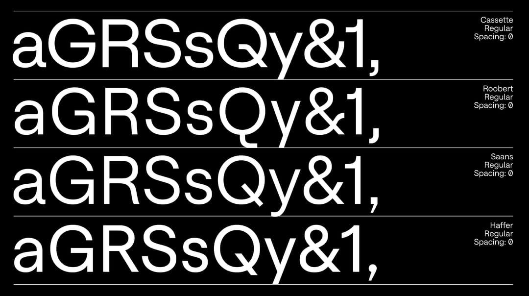
Different designs for certain characters.


The project pushes internal study of our sans-serif typefaces to its limits, exploring the last remaining possibilities.

Sharper angles, more technical.


Letters like “f, J, j, r, t” share sharper, more technical angles compared to their ancestors. Cassette also follows Roobert’s approach to terminals, without the more lively endings found in Saans and Haffer.

Info

description

The Cassette typeface is a compilation of letterforms developed during other projects – shapes that remained only as sketches in the lower drawer, along with new, original forms. Some of the shapes included in Cassette are even older than the typefaces they were originally meant for, such as some of the rock stars of Displaay’s library: Haffer, Roobert and Saans.

Over the years, this collection of all these unused but worthwhile ideas slowly grew into its own project. Cassette became a mixtape of hidden gems, unreleased tracks and favourite hits.

Being a neutral grotesk, Cassette is allegedly the last sans-serif typeface designed by Martin Vácha in this category. The design features: wide proportions – such as using almost exact circles for circular letters –  monolinear character and pure geometric constructivism. All of this is packed into tight typesetting, creating a nice tension between the shapes in headlines. Cassette is also perfectly suitable for longer texts, but in display use, it knows how to put your headlines in the spotlight.

credits
DesignMartin Vácha
AssistanceAndrea Biggio, Marek Čuban
Spacing & KerningIgino Marini
Details
Range21 Weights, 42 Styles
3 VF Axes: Weight, Slant, Mono
First SketchJan 2023
ReleasedSep 2026
UpdateSep 2026
Version1.000