David’s 2021 project Movie Title Design Lab explored different approaches to type animation and the potential of variable fonts.
The Winner is!
Thank you all for your assistance. We have a winner, and we now know how to name our typeface in progress.
The story
Meet Unknown, a new typeface by our in-house designer David Řeřicha aka Gibon. The project started back in 2021 during his studies, when David began exploring the idea of a typeface pushed to extremes—especially in width and weight. But from the beginning, this wasn’t just about static design. His main interest was movement: how type behaves on screen, in motion, in film and television.
That direction makes sense if you know David’s background. He moves naturally between type design and film, and alongside his studio work he’s active in the film industry, most recently working as a focus puller. Unknown grew right out of that overlap. The initial spark came from seeing variable typography animated on a corporate TV broadcast—something quite ordinary, but shown in prime time, and surprisingly impactful.
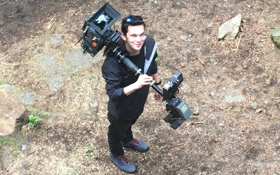
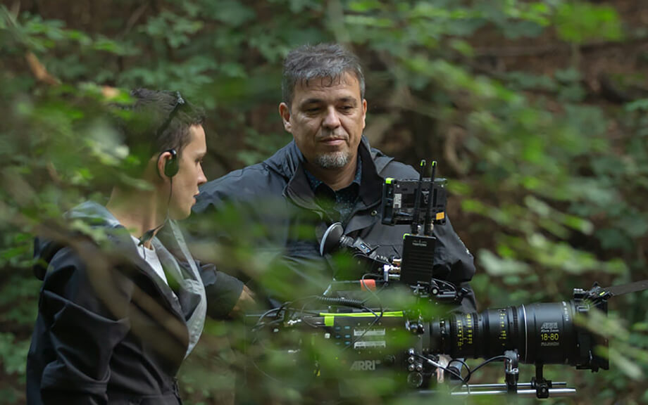
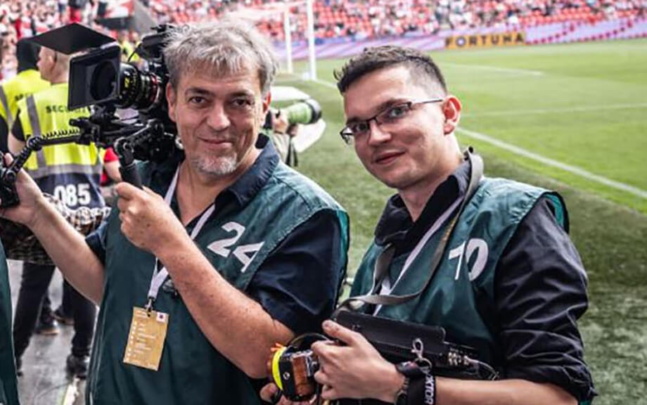
Camera or Glyphs? Outdoors or indoors? Type or film with his dad? Or all at once, that’s David!
1/0
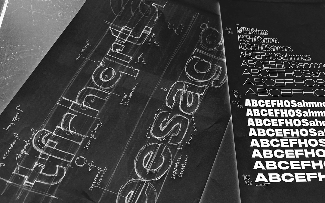
Does the market—and the Display Library—want another typeface built on extreme width and weight? Sure it does. That idea naturally led to the full development of the Unknown typeface collection.
The typeface itself began as a simple contrast: a thin, narrow style on one side, and a wide, heavy one on the other. From there, it opened up into a broader system. Even those early name ideas—Flexxin, Spectrrum, Extreem—hinted at this sense of range and flexibility.
Since then, David has been developing the project further, looking into how variable fonts actually work in practice—technically, visually, and commercially. Unknown is part of that ongoing exploration, questioning both the current limits and the still underused potential of variable typography.
A type in progress, soon to be named. Cast your vote and try the beta version.
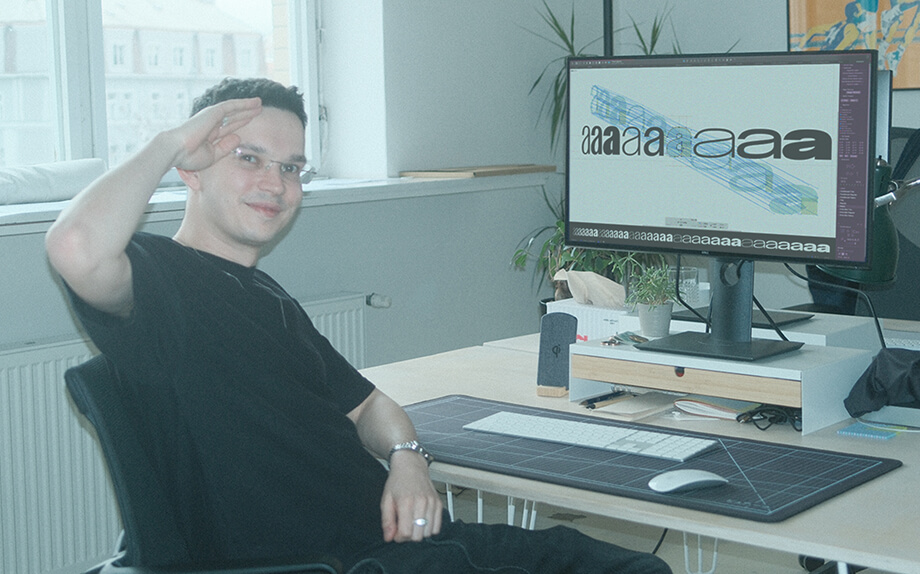
David and his nine masters.